Update: Capcom has since released the Resident Evil 4 version of these clips, and while I expected it, it does, unfortunately, give me pause on the whole thing. The new clip, showing off a cropped version of RE4‘s beloved Attache Case inventory, has also been edited and modified. While not as drastically, the top and bottom bar that boarders the Attache Case are now blank green bars, as opposed to the metal bars with text overlayed that’s visible in the in-game menu. The golden chicken egg item is also dead-center to this new4:3 cropped clip, as opposed to the center of the original 16:9 ratio in-game.
While I can accept that these have been modified for these easily digestible, Instagram style clips, it’s still very strange just how edited the RE1 and especially RE3 ones are. The RE3 clip showcasing 4 extra item boxes than possible and the File/Map tabs being changed to Files/Maps is frankly bizarre. For now though, it’s best to quell excitement. We were losing our minds with hype at the possibility yesterday, as all signs pointed to there being something deliberate happening here, but the editing to the RE4 clip may mean that this was all just for fun. Expect a RE5 clip tomorrow, which will most likely also have a degree of editing.
Original Story: Over the last few days, Capcom has been building up hype for the Resident Evil Showcase, which is due to stream next Thursday, January 21st. The main focus of the presentation will obviously be Resident Evil Village, but they also announced in their preview teaser that the stream will also highlight “more related to the Resident Evil franchise”. Thus far, our best guess has been something related to the just-announced Resident Evil multiplayer game, which is holding an invite-only beta just a few days after the showcase stream.
While building up hype, the official Resident Evil Twitter account has been tweeting a few classic Resident Evil videos showing off the old PS1 trilogy’s UI. Thus far we’ve gotten clips from all three of the original games, and based on the days remaining until the stream itself, we fully expect there to be clips from Resident Evil 4, 5, 6, and 7. That is until a few eagle-eyed fans noticed that the resolution looked a little better than it should on certain elements of the UI. I was curious, so I decided to do a direct side-by-side comparison and… these aren’t clips from the PS1 games. I think they’re clips from remasters.
All three videos showcase changes to the UI and visual quality of these games, from small and innocuous changes to massive and glaring ones. I took a few screenshots of both the original 1996, 1998, and 1999 games and directly compared them to the videos posted on Twitter, and the differences are shocking. Let’s start with Resident Evil ’96:
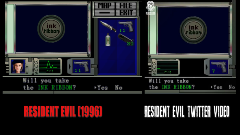
This one didn’t even register with me at first when it was tweeted three days ago. Jawmuncher over on Twitter got a little bit of hype rolling by pointing out that the Ink Ribbon model looked slightly crisper than normal. Putting the two side-by-side, I’m not really sure on that one… but that doesn’t mean that these two UIs aren’t massively different from each other. While the art style itself hasn’t changed at all, multiple elements have been moved around. The ECG and equipped weapon icon have been spread further apart, and Jill’s character portrait is missing entirely, and the MAP/FILES/RADIO/EXIT tab that sits above the inventory no longer sticks out, overlapping the inventory. In fact, the inventory window itself seems to have been smooshed up against the side of the check item window, whereas before there was a slight gap between the two elements. On a smaller note, the “Will you take the INK RIBBON?” text has been scooted over slightly, now resting entirely beneath the check item window, rather than the Yes/No option being beneath the inventory.
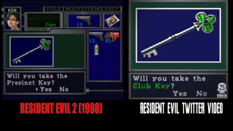
Next, we have Resident Evil 2‘s inventory, which might seem a lot less exciting as there is literally less to see here, but there are still a number of changes made here regardless — just a lot more subtle. The Precinct Key text has been changed to read Club Key outright (in Resident Evil 2, you have to check keys in order to reveal what their exact purpose is). The color of the key item icon itself has been brightened, as has the green color of the window. The window has also been condensed into a box, as opposed to the much wider window shown in the original.
Resident Evil 3: Nemesis‘s, however, is the one that really got me excited, and spurred on this whole comparison.
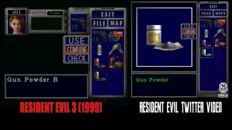
Unlike the small changes to Resident Evil ’96 and the even smaller ones for Resident Evil 2, the changes here are, quite frankly, startlingly massive. Gone are the equipped weapon and ECG windows, gone is Jill’s character portrait. The inventory itself now has 14 slots instead of the original game’s maximum of 10, the USE/COMBINE/CHECK box has been made much smaller, and the window the item artwork sits in has been made much larger and square unlike the squat rectangle from the original. The sort of jointed “fold-out” look of the USE/COMBINE/CHECK box has also been removed entirely. The item text has also been changed from ‘Gun Powder B’ to simply ‘Gun Powder’ and moving the cursor down and to the left from the Reloading Tool to the Gun Powder is much smoother, sliding across the tiles rather than jumping from one to the other instantly. On top of all of that, the text that normally reads FILE/MAP/EXIT has been made smaller, squatter, and the two main options have been made plural — FILES/MAPS.
The re-do of the text I’ve actually noticed is something that the Seamless HD Project mod for the Dolphin emulated version of Resident Evil 3: Nemesis also added, albeit that’s one small connection between the two. That mod also changed the in-game text to a cleaner serif font and lacked the changes made to the UI. I’m curious to know if this is a change made by both this Capcom video and the fan project to line up closer with the original Japanese text, but I have no way of knowing.
Listen, I know I sound totally nuts here, but it just doesn’t make any sense for Capcom to put this amount of effort into either changing the layout of these menus or reconstructing them from scratch for the sake of a few videos on Twitter that only a fraction of the fanbase will see and then totally forget about a day later. I genuinely think these images may be teases for a Resident Evil trilogy collection, releasing for the series’ 25th Anniversary. Hell, the 25th Anniversary logo has been watermarked onto all three videos, although obviously that can be waved away as more hype building for the showcase stream. I don’t doubt that we’ll be seeing Resident Evils 4-7 represented over the next four days, leading up to the stream, but I highly doubt that their menus will be changed in the way that these RE 1-3 clips are. Hiding these videos in plain sight along with videos from the other numbered games sounds like a great way to pretend that these changes don’t exist at all.
I totally accept that I’m in tin-foil-hat land, but something feels like it’s going on here regardless. We have less than a week before the showcase stream, which is already confirmed to be showing off more than just Village, so we’ll just have to wait and see.